UI-UX Thoughts
The problem with the typical calendar layout is that the boxes are restrictive, especially if you hope to have a lot of event listed on a given day. It clutters the box and makes it difficult to read...which is against the whole point.
In addition, based on the conversations I have had with several activists interested in using the calendar, there are a lot of different characteristics they want to attach to each event. They want to be able to search based on what's going on near them. They want to search based on the type of event (is it about the environment? Civil liberties?). They want to search based on what they are going to do (are we going to protest? Discuss? Learn?)
We can't show all that at the same time, because it would just make the calendar too busy. So the first step is determining what the user will see when they first show up to the site.
I think I want the design to look a bit like this, if possible: (sorry the image isn't bigger but if you want to blow it up, click the link below.)
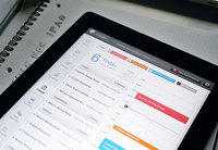
Essentially, picture the page in thirds, but in column lengths that are similar to the one in the picture. The third on the left is the toolbar. The middle column will show all the events going on that day. Each "event" in this display will only show the title and a colored dot that would identify the type of cause. I don't think there will be much more space to show more than that (although obviously you will be able to click on any given event and the complete details.
The far right column will be blank at first. When you click on an item, the complete listing will go into the right column.